
- Feature
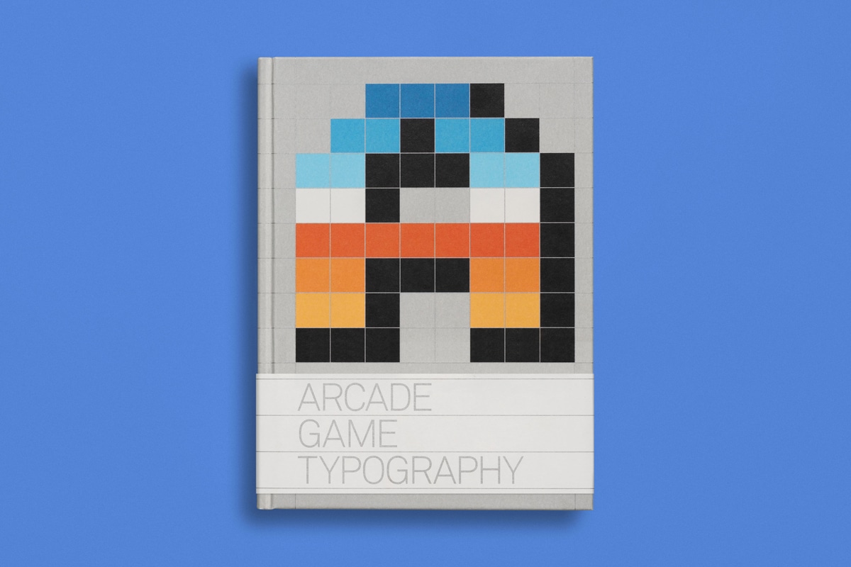
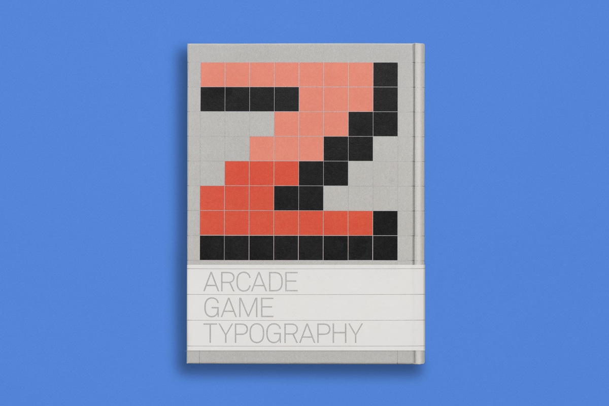
Typeface designer Toshi Omagari's visual history of Arcade Game Typography
11.12.19
Growing up in Japan in the 80s and 90s, typeface designer Toshi Omagari was surrounded by video games and their pixel-formed characters and fonts.
Now based in London and working for Monotype, Toshi went back to retro gaming and realised the diversity of pixel fonts in games. ‘These fonts have been with us the whole time, but there was no comprehensive effort to document them. Maybe because it was not considered a serious subject by professional typographers, or maybe too technically demanding. I was fortunate enough to be young enough to have grown up with video games, old enough to be professional in the type field, and most importantly, all the time to myself without a partner (I have one now!)’ he tells The Peep. Toshi started to gather them together, which ultimately led to the publishing of his book.
‘This book was very much a research-oriented project. Being an obsessive perfectionist, I wanted to conduct thorough research on the fonts used in games. Since 2016, I spent all of my nights and weekends on the research and writing. The research method was quite academic, and the time and effort spent on was almost equivalent of doing a PhD.’ he adds. ‘Each font was originally just images, which I converted to colour fonts using Python scripts and the font editor called Glyphs. I put together a big specimen of all the fonts using FireFox, and wrote comments on the fonts of my choice.’
Arcade Game Typography is published by Thames & Hudson and designed by Leo Field.